

from PressForTruth:
TRUTH LIVES on at https://sgtreport.tv/
by Anthony Watts, Watts Up With That:
 The BBC’s recent article “Climate change: The Panama community that fled its drowning island,” claims that the island of Cartí Sugdupu in Panama is being swallowed by rising sea levels due to climate change. This is false. The reality is that the island’s inhabitants are not being forced to relocate because of rising oceans, but due to overcrowding, poor infrastructure, and a lack of resources—issues that have nothing to do with climate change. Furthermore, real-world examples and peer-reviewed research contradict the idea that small islands are disappearing due to rising seas. Instead, many islands are growing, adapting, and naturally shifting over time. The BBC’s report is misleading at best, deliberately deceptive at worst.

by Laura Dodsworth, Daily Sceptic:

If you found a worm in your sliced bread you would be horrified. You would probably share photos and outrage on social media and return the loaf to the shop you bought it from.
Consider then that mealworm powder has just been approved by the European Union as a novel food ingredient and is now legally allowed to constitute up to 4% of food products like bread, biscuits, cakes, cheese, pasta and potato-based snacks.
But why mealworms? Why bread? And why now?
by Arsenio Toledo, Natural News:

from RAIR Foundation:

The U.S. Senate has just confirmed Chris Wright as Secretary of Energy, and the climate alarmists are already panicking. Wright, a straight-talking energy expert, is set to dismantle the disastrous Biden-era climate agenda that has strangled American industry while enriching global elites.
A longtime critic of climate hysteria, Wright has made it clear: there is no climate crisis. In a 2023 video posted on his LinkedIn page, he didn’t hold back, calling climate activists “scaremongers” and likening Biden’s energy policies to the failed communism of the Soviet Union.
by Charles Rotter, Watts Up With That:
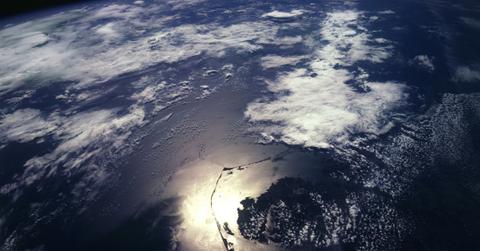 Ah, the Atlantic Meridional Overturning Circulation (AMOC) collapse—our old friend. Like a horror movie franchise that refuses to die, the idea that the Gulf Stream is about to shut down and plunge Europe into an icy apocalypse has returned. This time, the BBC is breathlessly warning that “the chance of it happening is growing”. But before you start knitting survivalist-grade wool socks, let’s take a moment to review how many times we’ve heard this story before—and why it never seems to pan out.
from New World Order Exposed:
TRUTH LIVES on at https://sgtreport.tv/
from FM8:
TRUTH LIVES on at https://sgtreport.tv/
by Michael Snyder, End Of The American Dream:
 Have you noticed that there has been a lot of seismic activity on the west coast recently? According to the Southern California Earthquake Data Center at Caltech, there have been 906 earthquakes in California and Nevada just within the past 7 days. Meanwhile, magma is on the move at Yellowstone, we are being warned that a gigantic volcano off the coast of Oregon could soon erupt, and houses in New England were just “shaking like crazy” after a very strange earthquake struck. We have been witnessing unusual seismic activity all over the globe in recent months, and I fully expect this trend to intensify even more in the days ahead.
by Tom Harris, America Outloud:
 President Donald Trump is to be congratulated for the many important and worthwhile actions he took in his day-one executive orders (EO) and other “Presidential Actions.” From an energy and environment perspective, the following stand out:
by Matt Agorist, The Free Thought Project:

(David Stockman) Here they go again, blaming the wildfire catastrophe in Los Angeles on Climate Change when the actual culprits are the very politicians who never stop howling about what is a monumental hoax.
In the first place, of course, the current raging California fires, like those which have periodically gone before, are largely a function of misguided government policies. Officials have essentially curtailed the supply of water available to LA firefighters, even as they have drastically increased the supply of combustible kindling and vegetation which feeds these wildfires. The latter, in turn, are being amplified by the seasonal Santa Ana winds, which have visited the California coast since time immemorial.
by David Lindfield, Slay News:

Scientists around the world are advancing efforts to fulfill Bill Gates’ plan to supposedly stop “global warming” by blocking out light and heat from the Sun.
Silicon Valley elites are throwing their financial weight behind a controversial scheme to fight “climate change” — worldwide weather modification.
One of the new VC-funded start-ups, Make Sunsets, has already launched balloons over Baja, Mexico.
The balloons are releasing sunlight-reflecting aerosols into Earth’s stratosphere.