

by Steve Kirsch, Steve Kirsch’s newsletter:
 I don’t know how doctors can ignore this; it is crystal clear. The slope of deaths per day post shot goes UP. It is supposed to go DOWN. You can’t ignore this. You can’t explain it.
Executive summary
If you do a simple plot of the absolute number of deaths per day after a vaccine shot is given vs. the number of days that have elapsed since the shot, other than for a brief 21-day period after the shot, the number of deaths per day will always monotonically decline over time in a safe vaccine.
TRUTH LIVES on at https://sgtreport.tv/
But for the COVID vaccine, it monotonically increases over time for up to 365 days straight.
This happens in every country, after every dose that I have data on! That’s stunning. It’s never supposed to go up unless something huge is happening in the background, and even then, it would be time limited.
A positive slope for 1 year post vaccination is unprecedented. It means the COVID vaccine is killing people. There is no other explanation. Nobody can explain it. Instead, they claim there might be a confounder and that my failure to find a confounder is not proof that no such confounder exists.
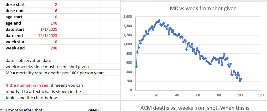
The New Zealand data “smoking gun”
From the New Zealand data time series cohort analysis over all ages and all doses, we see that the mortality rate climbs by 49% from week 5 (1,020) to week 23 (1,520). That is a stunning increase in less than 5 months. This is a fixed cohort (age mix) for 6 months (modulo the deaths which moves the cohort to be slightly younger over time making the huge mortality rise even more inexplicable). The mortality rate should be flat for any dose; it is determined by the mix of ages and comorbidities in the cohort. Adding flat to flat = flat. There is no Simpson’s paradox that can product a result that is anything other than flat over the first 6 months. The control is that it should be flat. It ain’t flat. Nobody can explain how that can happen. A 49% mortality increase in 5 months over a population of 2M people selected from 5M people in the a country is simply mind-blowing.
And we have other confirmatory signals that the huge number of excess deaths is related to the vaccine from the embalmers where they used to find clots in 15% of their cases, and now it’s in over 90% of their cases.
There is only one explanation that fits these facts: the COVID vaccines are deadly.
This is why the CDC never will show America the Medicare data. Never. The truth has to be hidden from everyone.
And this is why the medical community never asks to see the data.
If they saw the data, doctors would have to admit they were wrong.
The same effect has been observed in the four other countries I have this data on: New Zealand, UK, Israel, and the Maldives.
What more do you need to know?
Introduction
I’m going to show you below two charts from Medicare, all ages.
Note that Medicare is mostly older people and the average mortality rate is around 4% per year.
These are all people who got vaccinated in 2021 and it looks at the number of deaths per day since the first shot of the vaccine was given in that year (if more than one shot was given). The x-axis is the days since the shot was given. So it is relative to the day of the shot.
So the age distribution of the cohort is determined by the age mix of the people who got the shot in 2021.
Over a one year period, the age distribution will change by a small amount since people die. So the fixed size cohort (the number of people who got the shot in 2021) gets smaller over time.
Read More @ kirschsubstack.com
