by Peter Schiff, Schiff Gold:
Federal Budget
The Federal Government publishes the spending and revenue numbers every month. The charts and tables below give an in-depth review of the Federal Budget, showing where the money is coming from, where it is going, and the surplus or deficit.
This month saw a $22B deficit.
TRUTH LIVES on at https://sgtreport.tv/
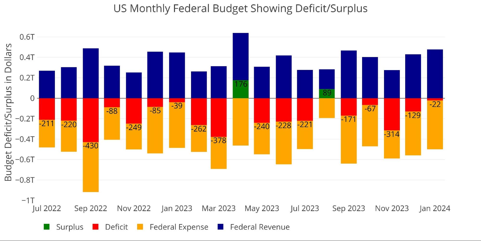
Figure: 1 Monthly Federal Budget
$22B may not seem like a lot, but January is historically a month with a surplus. That said, four of the last five years have seen January realize a deficit.
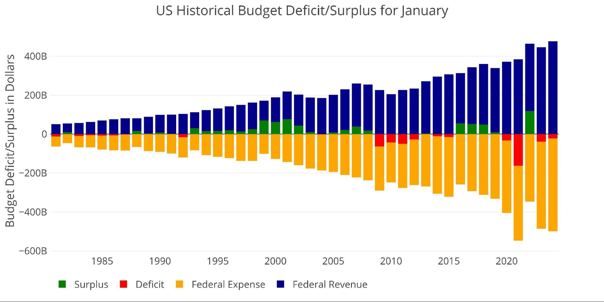
Figure: 2 Historical Deficit/Surplus for January
January is the only month other than April that has historically averaged a surplus.
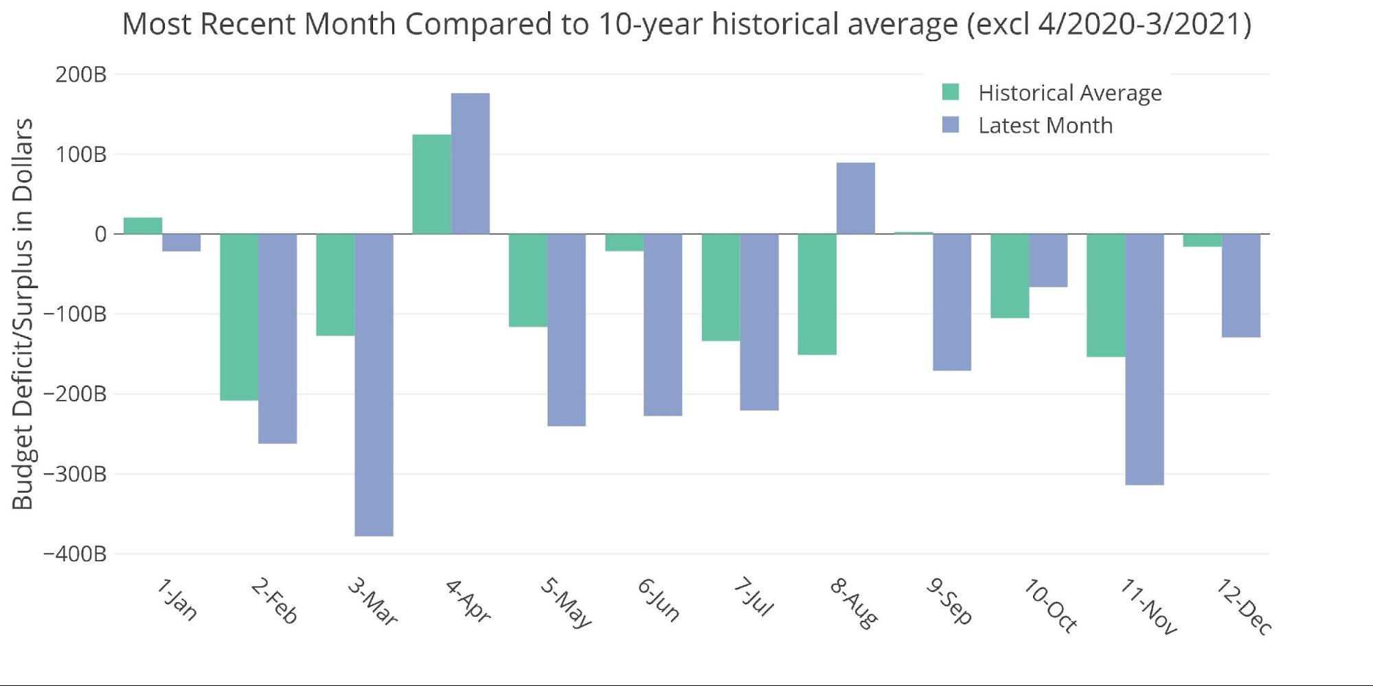
Figure: 3 Current vs Historical
The two Sankey diagrams below show the distribution of spending and revenue for the month and the trailing twelve months.
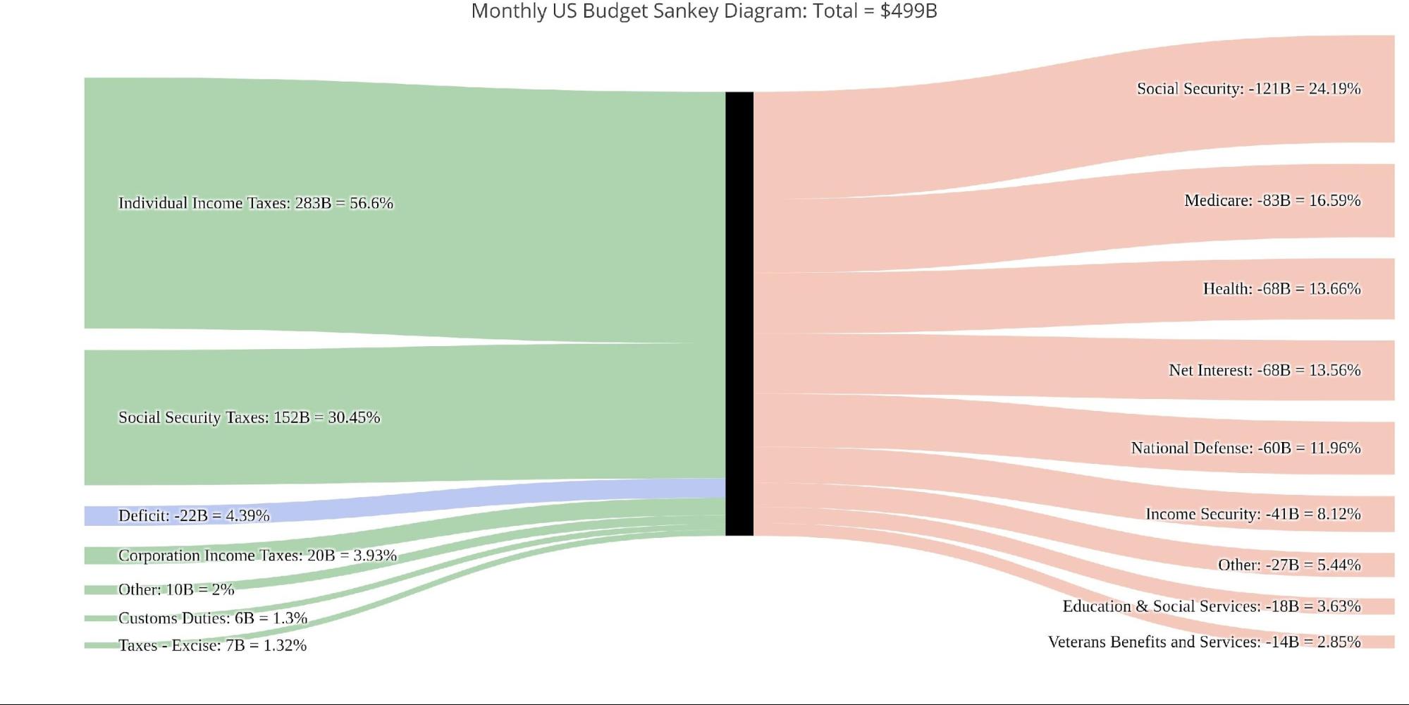
Figure: 4 Monthly Federal Budget Sankey
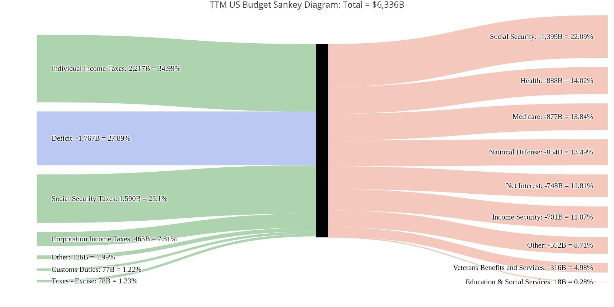
Figure: 5 TTM Federal Budget Sankey
The next two charts show the monthly revenue and costs broken down by expense type.
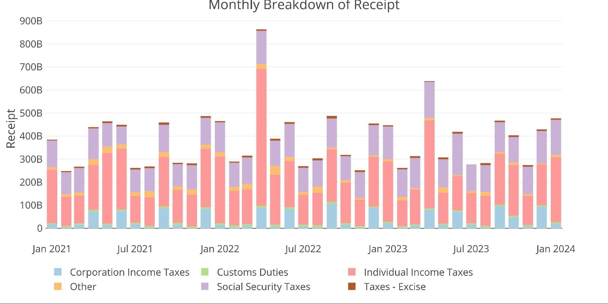
Figure: 6 Monthly Receipts
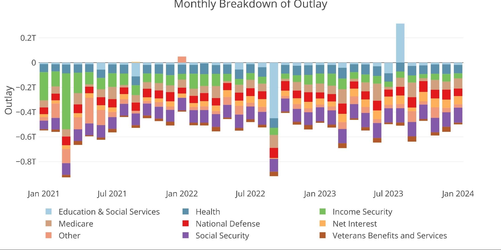
Figure: 7 Monthly Outlays
Interest Expense has ballooned higher with the Fed’s push to raise rates.
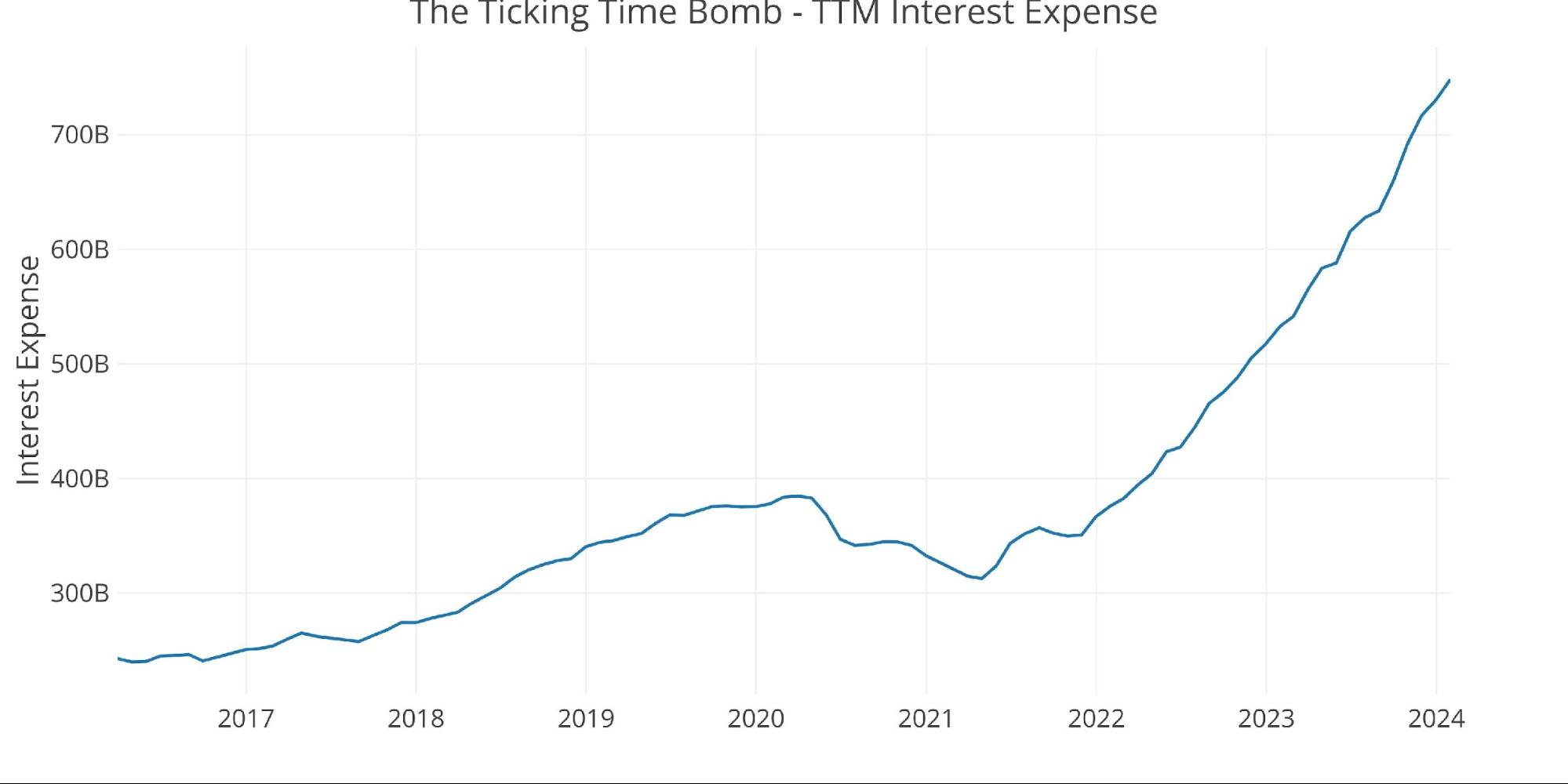
Figure: 8 TTM Interest Expense
The table below goes deeper into the numbers of each category.
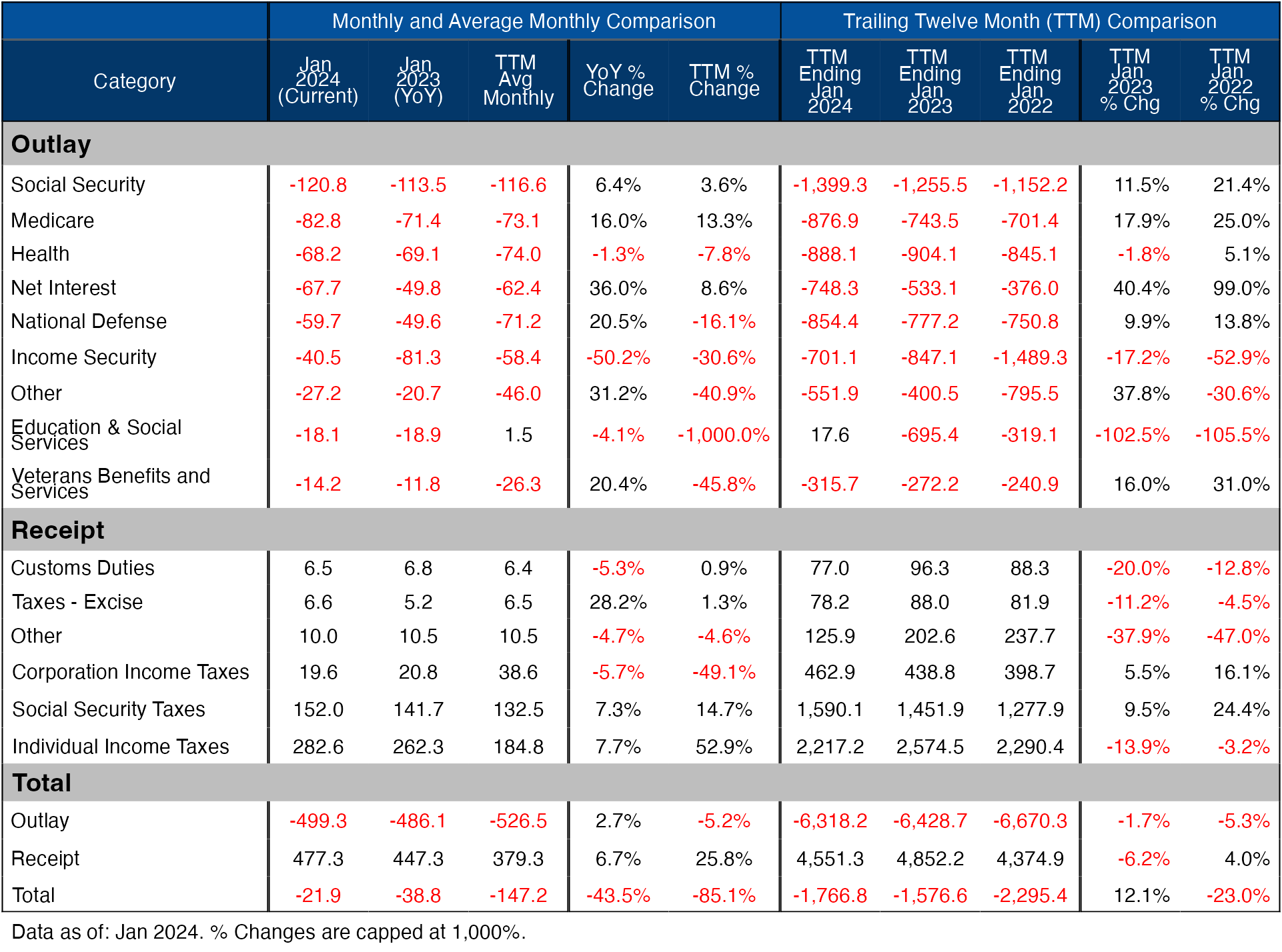
Figure: 9 US Budget Detail
Historical Perspective
Zooming out and looking over the history of the budget back to 1980 shows a complete picture. The change since Covid has been quite dramatic.
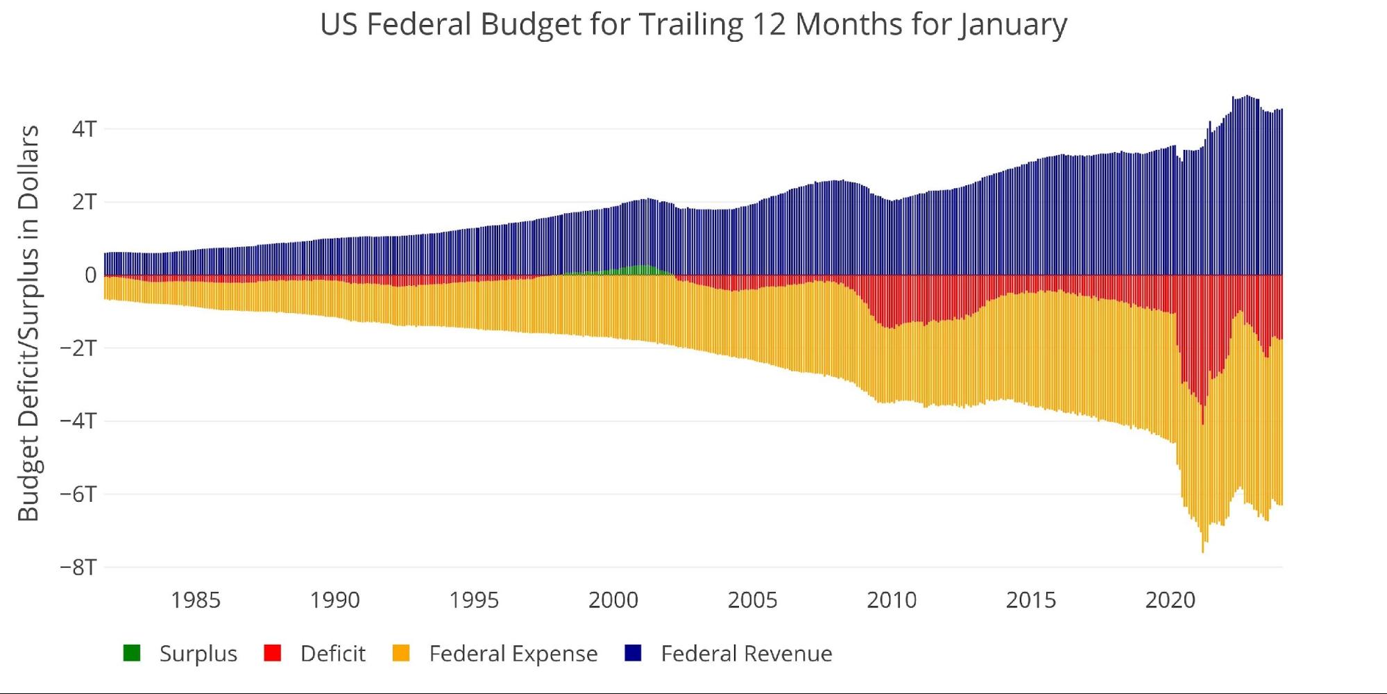
Figure: 10 Trailing 12 Months (TTM)
The next two charts zoom in on the recent periods to show the change when compared to pre-Covid. These charts show spending and revenue on a trailing 12-month basis period over period.


