

by Steve Kirsch, Steve Kirsch’s newsletter:
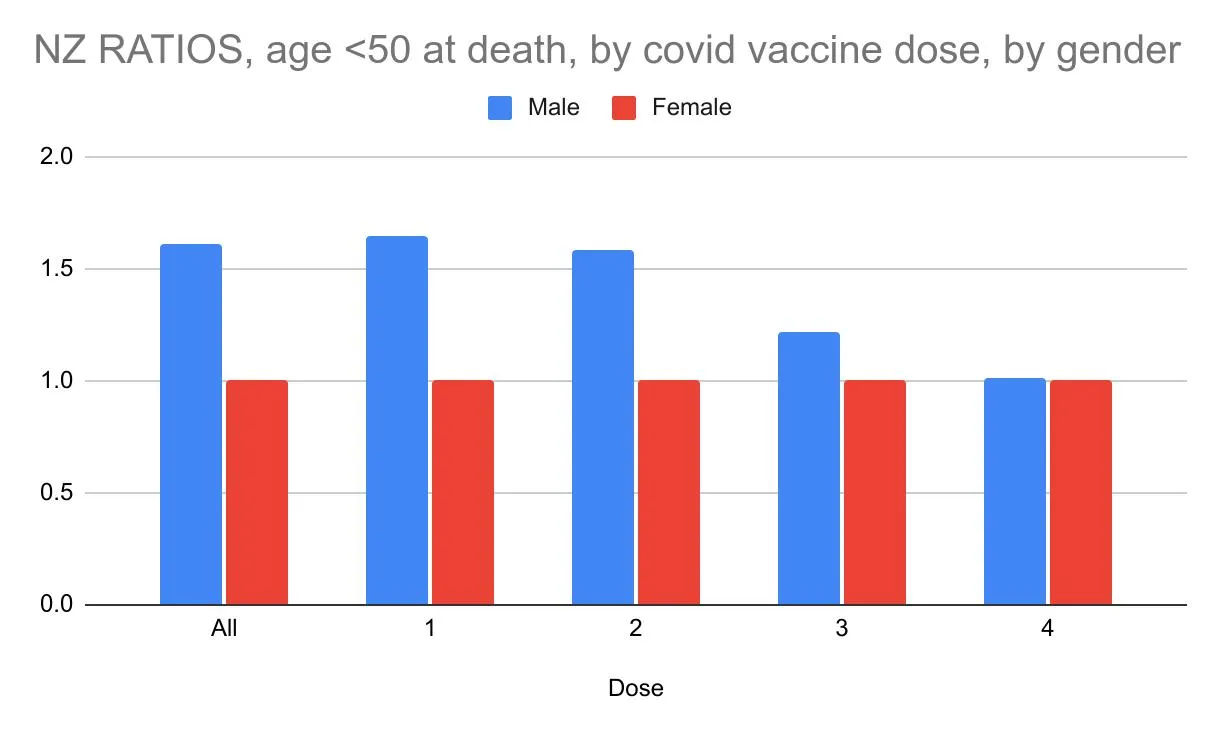
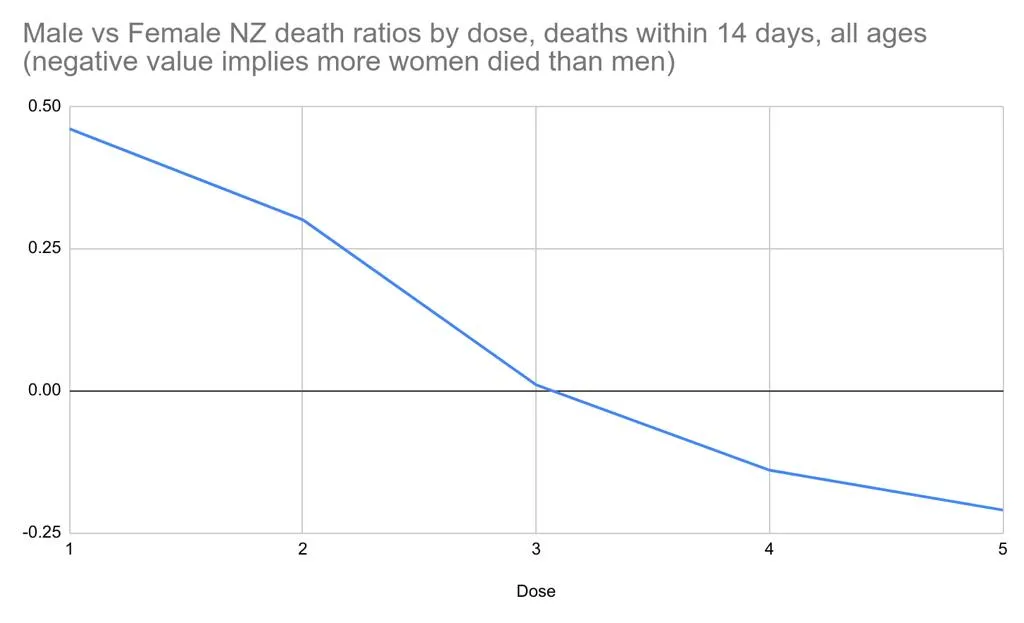
 Here are two more graphs from the New Zealand data when we look at gender effects. Gender effects should NOT be dose dependent if the vaccine is safe. Health New Zealand refuses to comment.
Executive summary
Safe vaccines should not be dose dependent when all other parameters such as the average age are the same.
Two new graphs allow us to visualize the gender disparities between doses. It’s stunning: there are large gender-specific mortality dependencies on the dose number.
TRUTH LIVES on at https://sgtreport.tv/
Health New Zealand refuses to comment on their own data.
And of course, the New Zealand mainstream press will not ask them about it either because that would expose the fact that the vaccines are not safe.
Earlier work
In my previous post, I showed that the gender disparity between male and female deaths is dose dependent and decreases with each dose for those between 40 and 77. There is no Simpson’s paradox explaining this because the average age of death was the same in each cohort. So the gender dependence on dose indicates the vaccine isn’t safe.
The new graphs
Notes
- The death counts for all ages (not gender specific), within 14 days of a specific shot goes from 260 (shot 3) vs. 315 (shot 4), a 21% increase. There are two possible causes for that: we might have more death data for shot 4, and shot 4 may be given at a time of year when deaths were high so the first 14 days would not be representative. There are 15% lower deaths in Dose 4, but the background deaths were 36% higher when Dose 4 was given. Guess what 36%-15% equals? 21%! So the absolute non-gender specific death number disparity in Dose 3 and 4 is easily explained by those two effects! Isn’t it stunning how math works?
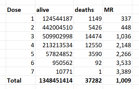
Death totals in the New Zealand data for each dose are shown above. Note that there were 15% lower total deaths in Dose 4 than Dose 3. 
- The gender analysis is limited; we can’t know the number of extra deaths from this analysis – only the number of extra male deaths. The fact that there is a gender disparity that is dose dependent is a problem for the “safe and effective” narrative.
- If females die more after multiple doses this would also give the appearance of decreasing male bias with increasing doses.
- Even if the absolute numbers are small earlier, overall, the larger concern regarding deaths after vaccination is what happens in the time-series cohort analysis which is coming up next.

Summary
This article adds 2 new graphs to my earlier gender analysis. A safe vaccine should not have large gender mortality disparities that are dose dependent.
Read More @ kirschsubstack.com