

by Steve Kirsch, Steve Kirsch’s newsletter:
 A new study covertly released by the Israeli Ministry of Health confirms what we know from the Medicare data: the COVID vaccines increase your risk of death over time.
Executive summary
In an earlier post, I analyzed the Medicare data that the CDC refuses to disclose. I found that the COVID vaccines increase your risk of death over time.
Now, the Israeli Ministry of Health has covertly released a new study showing the same thing: that the COVID vaccines significantly increase your risk of death for at least 180 days post vaccination.
TRUTH LIVES on at https://sgtreport.tv/
Here is an English-translated version of the study so you can read it for yourself. Note that many important details are omitted in the report.
The study shows the vaccine gradually increases the risk of death over time with a peak at 4 months from the shot. This is why it is so hard to see compared to a vaccine which causes a massive number of deaths shortly after the shot. But they don’t blame the vaccine. Instead, they claim that the increase in mortality is due to the healthy vaccinee effect (HVE). This is a “hand-waving argument” which has no evidentiary basis whatsoever (any HVE effect would be very small and very time limited).
The study also shows very clearly that the vaccines are increasing serious cardiovascular events in ages 12-29 after the shot with a peak on Day 3 that should not be ignored by anyone, but is being ignored by everyone including the people who wrote the study!
They wrote, “The results regarding cardiovascular events close to the vaccination did not indicate an excess risk 30 days after the vaccination.” Seriously?!? You’d have to be completely blind not to see the HUGE spike on Day 3 after the shot. This is a perfect example of gaslighting.
The only explanation that fits is that fits the evidence: the vaccine is increasing your risk of death over time just as I wrote two weeks ago in my article about the Medicare data and that the vaccine is causing cardiovascular events in young people.
The report
The report looked at all those vaccinated with two doses until the end of October 2021 (before the start of the Omicron wave) who died during the 60-day follow-up from the vaccination and who were not positive for corona (1815 cases) were included.
NOTE: They do not tell us how many cases were excluded. For example, many people get the vaccine and quickly get COVID and die.
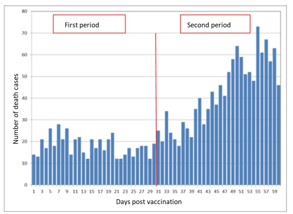
Figure 1 shows the distribution of the number of deaths according to the duration of time since the vaccination.
Here is the first 60 days:
It’s supposed to be a completely flat line. Does this look flat to you?
It doesn’t to me.
The scientists can’t explain the huge rise from 10 to 20 deaths a day to over 70 deaths a day.
I can. It’s the vaccine. We saw the same effect in the Medicare data. The death rate kept increasing over time after you got the shot.
Was this unique to the Medicare data? I don’t think so. We’d see it in the overall death data as well, but NOBODY WILL RELEASE THE VAX-DEATH DATA TO ALLOW US TO LOOK as I’ve complained about in my earlier article on holding the data hostage. No health authority in the world will release this data. When you ask and offer to pay for it, they ghost you.
I’ve only found one county health official in the world who is going to do this. I have to keep her identity a secret of course until the data is out.
Deaths post-vaccination are supposed to be a flat line if the vaccine is safe
Deaths happen with a Poisson distribution. If you have a large population, it will be a completely flat line if you are measuring days after an event for a perfectly safe event that is evenly distributed over time.
These charts are from my Game Over article for two different vaccines: the flu vaccine and the pneumococcal pneumonia vaccine.
See how the lines are all FLAT?
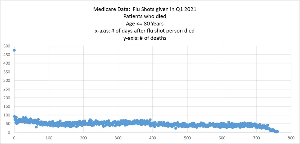
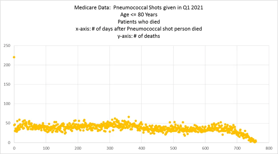
The healthy vaccinee effect (HVE)
If you look closely, you can see that there is a slight rise in the slope for the first 20 days. That’s the HVE effect. It’s small (<20% reduction in deaths) and very short lived (<20 days).
The reason it occurs is that if you know you are going to die in a few days, you don’t get vaccinated with a vaccine.
For Medicare, this effect is larger because there are simply a larger number of people who know they only have a few days to live.
Read More @ stevekirsch.substack.com
